Transforming the Tube map: Harry Beck’s iconic design
Introduction
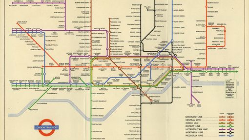
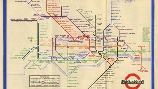
Among the most famous elements of London’s public transport heritage is the colour coded and clear diagrammatic map of the London Underground network. The man behind this style of map was Harry Beck, a draughtsman for the Underground, who came up with a new approach in his spare time in the early 1930s.
While the map has continued to evolve since, it has largely maintained Beck’s principles – a testament to the quality of his design. Despite this, for many years Beck did not receive the recognition he deserved.
The first Tube maps
The first maps showing the whole London Underground system were produced in 1908, as posters and in a new folding pocket map format.
While earlier maps emphasised just one line, usually in red, the new map used a full range of colour coded lines for the different services, overlaid on a simplified street map.
Though there were several companies involved, the map presented the network as one system for the first time, under the new UndergrounD name and logo.
Though it may not have been instantly understood by all, it was a marked advance on its predecessors, setting the ground rules for the next twenty years. As the area it needed to cover expanded, the map’s designers started to distort geography by increasing the relative size of the dense central area, to maintain clarity. Lines became straighter, curves more regular, and though it was not completely eliminated, the street map background became fainter and was sometimes omitted altogether.
Fred Stingemore, a draughtsman, photographer and occasional poster designer for the Underground, simplified the map further in the 1920s and early 1930s.
Enter Harry Beck
Henry Beck, known to friends as Harry, had been a draughtsman for the Underground since 1924, working his way up from the signalling department to the Commercial Drawing Office, at the Underground’s headquarters.
During a spell out of work in 1931, he worked on a new diagrammatic design based on the sequence of stations, the ultimate direction of lines and where they intersect rather than geography.
He limited his design to horizontal, vertical and 45-degree lines, magnifying the central area and compressing the outer reaches, with stations represented by equally spaced dots.
When the unemployed Beck offered his unsolicited design to the publicity office in 1931, it was rejected: ‘My Underground map was handed back to me, and it seemed like that was the end of it. But I did not lose hope and the following year I decided to have one more try’.
In 1932, the design was accepted, but with some remaining ambivalence.
Frank Pick, the Chief Executive and Vice Chairman of London Transport, believed in the power of design to serve society. But Beck was an outsider from a technical rather than creative background. He was not a ‘real’ designer from Pick’s circle of artists and designers in the Design and Industries Association.
The first pocket map was printed in January 1933, including a note on the cover requesting comments from users. Though the Railway Gazette reported in July that a ‘very large number’ of responses were received, there is no mention of these in the publicity office records.
There were requests for a series of small changes during 1933 and 1934, but it seems that any serious reservations had already been overcome by the time the order for the first print run.
At this time maps were typically printed in batches of 10,000-20,000, but the first printing of Beck’s map was 750,000 copies, enough to last until the summer. Frank Pick gave his approval in August when he acknowledged, with typical understatement, that it was ‘very convenient and tidy’ and ‘a better map than any we have had so far’.
The map was an instant success, with the striking clarity of the design evident to these two passengers outside Chancery Lane station in 1935. Yet Beck himself was never completely satisfied with the design.
As well as responding to requests for alterations from the Underground, he continually worked on it in his spare time, experimenting with new ways of indicating the many interchange stations and the accommodation of new lines.
Beck remained the principal designer of the Underground map between 1933 and 1959, and while geographical Underground maps were still produced occasionally, the diagrammatic form was quickly and wholeheartedly accepted.
Revisions to the map
Beck had a sense of ownership of the design that London Transport apparently did not share, and to his dismay, maps were occasionally commissioned from other designers. The graphic artist Hans Schleger, for example, produced pocket maps between 1937 and 1941.
Though Schleger was not given a printed credit, and the designs were clearly based on Beck’s own principles, Beck felt slighted.
In a way the design was a victim of its own success. Beck created a template that was rigorous, yet versatile enough that new additions and developments could be accommodated. He made it look easy.
So it was that London Transport Publicity Officer, Harold Hutchison, ousted Beck as the designer of a ‘new look’ map in 1960. Beck was not informed of plans for the new map and was deeply hurt. His connection to the map had been only an informal arrangement that continued when he left LT to take up a teaching post at the London School of Printing. Hutchison’s design was not popular but served to show how difficult it is to make something look simple.
Despite its deficiencies, Hutchison’s map was used for four years before being replaced. The next designer, Paul Garbutt, restored many of Beck’s principles, enabling the addition of several new extensions and lines over the next twenty years, often working with in-house designer Tim Demuth.
Recognition
Harry Beck died in September 1974. For many years his name was relatively unknown, but since the early 1990s, interest in the man and recognition of his work has been growing, thanks initially to his friend, the graphic designer Ken Garland.
In 1993, Garland donated Beck’s 1931 presentation drawing to London Transport Museum, and a year later published Mr Beck’s Underground Map, which was followed by a BBC documentary and considerable media interest as the 1931 artwork went on display for the first time.
Since 2001 all Underground maps have included the credit: ‘This diagram is an evolution of the original design conceived in 1931 by Harry Beck’. In 2006 the map was voted second-favourite British design of the 20th century in a national contest.
Discover more about the history of London's Underground map
London’s diagrammatic Underground map can truly be described as a design classic. See how the map has evolved from tracing the first railways in the Capital to encompassing an integrated network that covers ever growing distances.
Explore how London’s iconic Tube map has been used and adapted to celebrate the Capital’s history and people.
Do you know your Overground from your Emirates Airline? Think you know what colour the Elizabeth line will be? Test out your Tube map knowledge with our latest quiz!


