Hans Unger: the multi-dimensional poster artist
Introduction
Born in Prenzlau, Germany in 1915, Hans Unger was one of the UK’s most important post-war graphic designers.
Unger studied poster design in Berlin but left for South Africa in 1936, having realised that his Jewish heritage made life dangerous in Nazi Germany. He was one of a generation of émigré designers to flee Nazi German influence and ultimately settle in the UK.
Unger joined the South African Army in the Second World War, being taken prisoner in 1942 at Tobruk in Libya. He was held at a prisoner of war camp in northern Italy, from where he dramatically escaped across the Pyrenees to Spain and then Portugal, losing several toes to frostbite. Unger was awarded the Military Medal for bravery in 1944.
In peacetime, Unger reignited his graphic design career. In 1948, he moved to London and became a British citizen. Unger’s design career flourished, with clients including London Transport (LT) and the General Post Office, among others.

Unger developed a recognisable style using bold, joyful colour and often incorporating humour. From 1960, he often utilised mosaic in his work, in partnership with Eberhard Schulze. Unger continued a successful career until his death in 1975, at the age of 59.
Here we explore Unger’s lively and varied work on LT posters over the course of his career.


Hans Unger began undertaking poster commissions from LT soon after settling permanently in the UK, designing numerous posters for them in 1950 and 1951. These two early examples show his use of varied techniques.
‘Lord Mayor’s Show’ is a small format panel poster using a fluid, illustrative style. By contrast, the original artwork for ‘Music’ is a three dimensional piece pointing towards techniques Unger was using more regularly in his later work.
‘Music’ promotes the capital’s music venues and uses painting, mosaic and collage. Composer Johannes Brahms plays the piano, upon which are busts of Beethoven and Bach, while a photo of Benjamin Britten looks on. The cut-off ends of brass instruments add a sculptural quality. The artwork was photographed, with text added beneath, for the printed poster.

This artwork was one of twelve posters in a campaign intended to stimulate leisure travel to attractions in summer, combining humorous imagery with a limerick. This design promotes Whipsnade Zoo via LT Green Line buses.
Unger manages to connect animals with London’s urban environment and the limerick beneath, which has been stuck to the artwork to mock up the full design. It typifies his playful and colourful style.


In 1960, Unger set up a studio with fellow German-born artist Eberhard Schulze to produce mosaics and stained glass windows. These two posters, ‘Zoo aquarium’ being the original poster artwork, are typical examples of how Unger and Schulze incorporated these techniques to make distinctive poster designs.
Unger learnt about these techniques when travelling in Italy in 1959, having used small elements of mosaic in earlier work. Unger and Schulze often fused stained glass and ceramic and experimented with new materials and processes. As well as using these techniques for posters, they also completed mosaic murals for corporate and public buildings and stained glass windows for many churches.


At the same time as working with Schulze, Unger continued to complete many poster commissions on his own. These two examples show his use of thickly applied paint, as well as painted paper collage attached on the left of the ‘Nash’s London’ artwork. As with his mosaic work, Unger was keen to incorporate interesting coloured textures in his posters, creating a striking impact.
Both of these poster designs focused on historic interior and exterior architecture. The first one highlights trips to see monumental brasses displayed in churches across London, while the second encourages public transport visits to see the work of prominent Georgian and Regency architect John Nash.


These posters combine aspects typical of Unger’s work – bold colour, humour and, with ‘Art Today’, three-dimensional elements. Both demonstrate 1960s pop art influences in their use of unnaturalistic colours and bold graphics.
‘Art Today’ references the Tube map and Underground roundel in relation to modern art. ‘The Tower’ manages to promote trips to one of London’s oldest buildings through a playful design, the only historic elements being the essential shape of the Tower of London and the dozen reproduced illustrations of ‘guests’ of the Tower over the centuries.


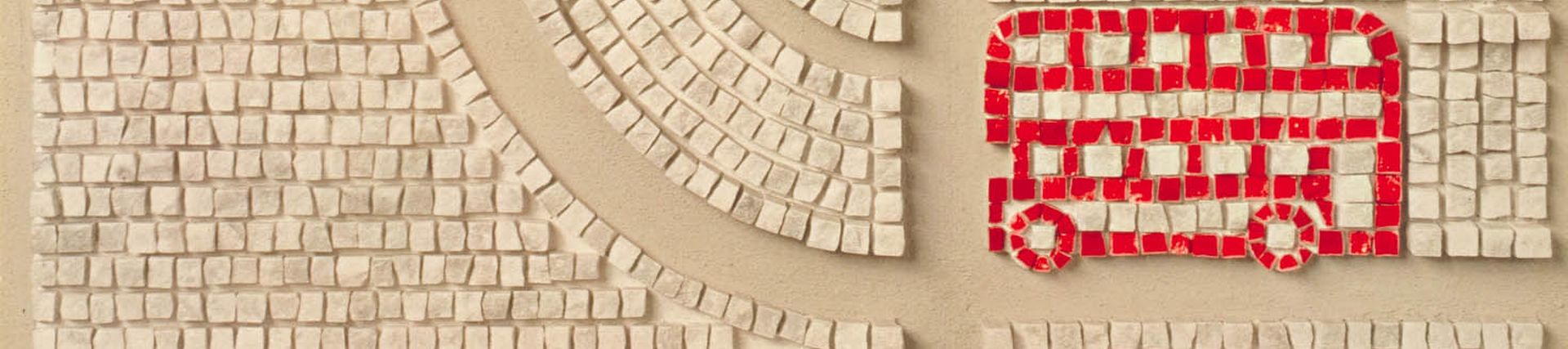
‘Busabout’ is another prime example of Hans Unger’s fruitful use of mosaics with Eberhard Schulze in a LT poster.
The relatively muted colour palette focuses attention on the iconic red London bus, whose services this was promoting. The colour, texture and three dimensional quality of the mosaic gives the impression of an aerial view of historic and labyrinthine central London, adding interesting depth and shadow. The bold geometric shapes make it modern, but the ceramic stone colours also emphasise the centuries-old architecture.
This was one of Unger and Schulze’s last LT collaborations. They completed their final mosaic mural in 1973.


Unger’s stylish and clever ‘Waterside London’ uses a two-colour palette to evoke rippling water, but with the shadow of a pike lurking at the bottom – a poster designed to intrigue the viewer to give it more attention. LT published the poster to promote travel to the city’s rivers, canals, streams and lakes.
This was among the last of Unger’s 117 poster designs for LT, and he died three years later. Examples of Unger’s work live on, including his tile motif at Brixton Underground station on the Victoria line. Typically even this demonstrated Unger’s sense of humour, his ton of bricks design being a visual pun on the station’s name.
Global Poster Gallery
Discover Hans Unger’s work, as well as other influential artists from the 20th century, in our new Global Poster Gallery.


