Creating an identity: why and how London Transport posters were created
Introduction
London’s public transport system is known the world over. That fame is partly due to its long history, including the world’s first underground railway. But it is also a result of its clear brand identity encompassing the recognisable roundel symbol, the influential diagrammatic Underground map, the Johnston font lettering, distinctive architecture, vehicles and even the fabric of the seats within them.
A key pillar of that brand identity has been posters, used to advertise and encourage travel on the network. Here we explore how and why posters were first commissioned by the Underground and how they quickly and deliberately fostered an association between London Transport’s identity and high quality art and design.
Frank Pick
Frank Pick is best known as the first Chief Executive of London Transport (LT) when it became a unified public transport network for the capital in 1933. But his association with the organisation began much earlier when he joined the Underground in 1906.

In 1908, Pick was made responsible for the Underground’s publicity. He decided to commission pictorial posters for the first time, tapping into a growing trend. In this period, most posters were made up of lettering, with little or no imagery. Yet the period was starting to see more expansive and visual poster design. Pick’s decision meant that the Underground was to be at the forefront of that trend in the UK.
The early posters


This design by John Hassall was the very first Underground pictorial poster commissioned by Frank Pick. Hassall was a highly popular illustrator who in the same year also designed a famous poster advertising trips to ‘bracing’ Skegness, featuring a jolly fisherman.
This design references several of the pillars of the Underground’s growing identity – the ‘UndergrounD’ lettering, a colour-coded map of Underground lines and the decorative tiling of Tube stations of the period. The poster indicated there was no need to ask the policeman for help because all these elements made the system easy to navigate. In addition to this message, the poster also aligned the Underground with a recognisable and high profile artist.
Star designers
Under Frank Pick’s direction, the Underground rapidly began to work with an array of poster artists, from the established to the up-and-coming. Pick was keen to represent fast-developing trends in graphic design so as to be at the forefront of this medium.

Perhaps the ultimate example of this was Edward McKnight Kauffer, an American-born designer who was first commissioned by the Underground in 1915. This began a mutually beneficial partnership, with Kauffer quickly establishing himself as one of the leading poster designers of the era and the Underground and LT being his most significant client.

Kauffer’s early designs were highly decorative, featuring flat colour and hand painted lettering. His later work demonstrated the influence of modernist art movements through bold and impactful designs.
The commissioning process
When commissioning a poster, the Underground and LT would decide what message they wanted to convey. This resulted in a brief for the chosen poster designer, usually issued by the Publicity Officer and their assistants.
The artist would normally provide a submission sketch that, if agreed, would be worked up to larger size, ready for passing to the printers. However, even established artists could have their submissions rejected.

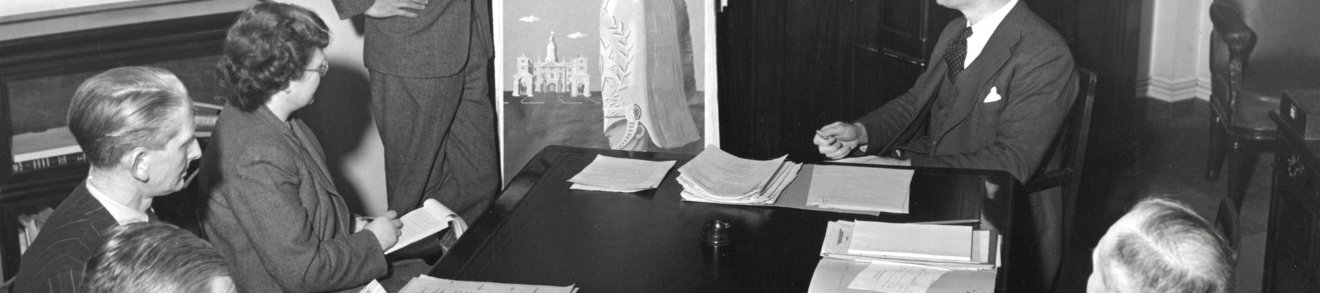
This photo from 1950 shows the Publicity Officer of the time, Harold Hutchison, standing and discussing a poster submission at a LT Public Relations committee meeting. A similar scene would have played out in the era of Frank Pick. Decisions were often made by committee, but sometimes on the personal whim of Pick, Hutchison and their successors. These decision-makers were invariably men, although LT did work with a large number of women designers.


These items illustrate a LT poster commission by Abram Games that proceeded smoothly. The printed posters had the central figures positioned the other way around, but otherwise these artworks are identical to the published versions. They typify Games’ work in cleverly using the LT roundel in stylised symbolic figures bowing to echo the ‘at London’s service’ message.
The letter from Abram Games to LT Publicity Officer Harold Hutchison expresses appreciation for being allowed ‘free scope’ and for the guidance offered. However, commissions could often be more arduous, involving several rounds of feedback.
Display


In commissioning posters, London’s public transport network effectively had the city’s largest public art gallery to display them. The photograph dating from 1907 shows the scene outside stations just before the Underground began commissioning posters, with a mess of varied and predominantly text-based posters.
By the time of the 1931 photograph, the Underground had decorative poster frames on many station exteriors, sometimes displaying two, three or even four posters deliberately together. This typified how posters were at the heart of the Underground’s brand identity by the early 1930s.


As well as station buildings, London public transport posters were also displayed on vehicles, using formats unique to the system. Panel posters, in two size formats, were displayed on the sides of buses or within vehicle interiors. They often focused on leisure travel and specific events. These two examples by Hans Schleger and Joy Williams illustrate the two main formats of panel posters.

Bus stops and trams shelters, like this one, also formed part of the poster displays. By 1938, LT managed 480,000 poster sites across its network and fleet of vehicles, of which about 120,000 were reserved for the company’s own publicity.
Reception
Within a few years of the first commissions in 1908, Underground posters became a byword for stylish design. By 1933, when a unified London Transport was created, its posters were expansive at a time when this was one of the main forms of mass communication. While posters gradually became less influential from the 1960s and 1970s, London Transport continued publishing wonderful examples that maintained its reputation for art and design.

In 1928, a sizeable exhibition at Burlington House marked twenty years of Underground posters, helping to emphasise that this form of commercial art was worthy of an art gallery. Frank Pick was keen to push this angle by proactively donating Underground posters to the Victoria & Albert Museum, the national museum of art and design, among other collections.


In 1949, the ‘Art for All’ exhibition of LT artwork and posters was held at the Victoria & Albert Museum. It continued to reinforce the message that LT poster art was worthy of consideration among some of the finest art and design around.


The attractiveness and quality of Underground and LT posters was also reflected in the fact that they were available for sale. These photos show LT poster shops at Griffith House and St James’s Park Underground station in the 1970s. This reflected how the posters had transcended their immediate function as a communication and marketing tool.
Over a century of posters
Since 2000, when Transport for London (TfL) was created, the network has continued to commission posters. However, this has been on a far smaller scale than the height of LT’s poster commissioning in the mid-1930s. This is fundamentally because posters became a less dominant means of mass communication from the 1960s, with the influence of television advertising, photographic methods and advertising agencies.

It is still possible to see parallels across more than a century of poster design. In 2017, Esther Cox designed this TfL poster deliberately echoing the imagery and composition of a Horace Taylor design from 1926, but also emphasising the greater cultural diversity of modern London and its people.
But perhaps above all, Frank Pick can rest easy that TfL today is still associated with a strong sense of art and design style.


