Adapting a design classic: alternative Tube maps
Introduction
In 1933, the diagrammatic London Underground map first appeared, becoming the basis of Tube maps ever since. Designed by Harry Beck, it immediately stood as a symbol of a newly unified London Transport. It quickly became a key component of the company’s identity and so, by extension, the identity of London as a city. While Beck’s design has been tweaked over time, its essential elements have remained relatively intact. The story of its development can be discovered here .
The familiarity of the Tube map and its status as a classic design mean that it has been repeatedly adapted for a variety of purposes. These range from celebrating Black history and the contributions of Black Londoners over time to celebrating the history of the London Underground itself. Here we explore a small selection of these alternative Tube maps.
Celebrating Black history

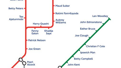
In 2021, a new Tube map was published after a collaboration between Black Cultural Archives and Transport for London (TfL). In place of stations, the map includes the names of 272 Black people across a wide sweep of history who have contributed to London, and the UK as a whole. They range from world famous people such as Mary Seacole and Marcus Garvey to individuals whose stories are relatively little known, but just as important to celebrate.
Across the 272 names are four London transport workers, who you can read more about here. Included in the map are Joe Clough, who became London’s first Black bus driver in 1910, and Lewis Bruce, thought to be one of London’s first Black tram drivers at the beginning of the twentieth century. London bus driver Blair Blenman, originally from Barbados, is included both for his contribution to London’s transport and his sporting achievements as a weightlifter. Momodou Samba, born in Gambia, served London Transport from 1947 to 1990, saving a passenger’s life in 1962 through his decisive action.
To find out more about the Black History Tube Map, please visit the TfL blog. To buy your own poster of the map, please head to the Museum’s online shop.
Mapping the ‘stars’
In 1992, British artist Simon Patterson took the 1991 London Underground map and replaced the stations with the names of famous cultural figures for a limited edition print. Each Tube line represents a different category of ‘celebrity’, from philosophers to footballers and from engineers to comedians. The prints were presented in anodized aluminium frames, in the same style as the maps on the network.
While the 1991 map had been revised over the decades, it still retained the essence of Harry Beck’s accessible design that has been used to navigate London since 1933. Patterson combined this with the title ‘The Great Bear’, a reference to the Ursa Major constellation of stars that has been used for navigation since ancient times. Patterson’s playful arrangement of the ‘stars’ challenges and pokes fun at the function of these systems and ideas of what is important in the modern world. Whichever way it is interpreted, the artwork attests to the incredible familiarity of the Tube map.
Two design classics in one
The year 2013 was the 150-year anniversary of the London Underground network, which had first begun with a small section of what is now the Metropolitan line in 1863. To mark the occasion, five special maps were constructed out of LEGO by master-builder Duncan Titmarsh. This one is a LEGO version of a full Quad Royal poster-size Tube map from 2013, representing the system as it was 150 years on.
The other four maps built represented significant moments in the evolution of the map in 1927, 1933 and 1968, as well as a prediction of what the map may have looked like in 2020. Each one took four days to build and was made from more than 1,000 bricks. It seemed particularly appropriate that one iconic and evolving design could be rendered using another. Both the Tube map and LEGO are famous around the world.
The Tube in tubes of paint
Since 1908, the London Underground has had a rich association with pictorial posters, particularly between the 1920s and 1940s. By the 1980s, the number of posters commissioned was much reduced, but there were still interesting and memorable designs.
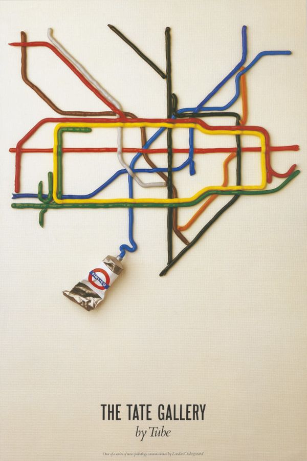
This poster, commissioned in 1987 as part of the Art on the Underground series, is one of the most popular of that period. It was designed by David Booth of the agency Fine White Line and cleverly plays on the word ‘Tube’ to link the Underground network with the famous Tate Gallery through tubes of paint. The poster design reduces the Harry Beck-inspired diagrammatic map purely to a series of artfully arranged coloured lines, showing how the essence of Beck’s design could still be conveyed through this simple means.
A record, a tray, a rug and a stamp
The diagrammatic Tube map is so familiar and emblematic of London that it has come to be used on a whole range of objects and products, whether for decorative or practical purposes.

In 1967, the novelty music hall pop group the New Vaudeville Band used the map and roundel to highlight the title of their single ‘Finchley Central’, which took the name of the Northern line station. Even more typically, a souvenir tea tray from the early 1980s reproduces the Underground map of the period. Today, the current network map is an important part of Transport for London’s identity and intellectual property.
The Underground map has inspired very individual objects, but also been recognised as a world-famous British design classic.
In 1992, American Sheila Small was so impressed with the diagrammatic map on a visit to London that she created her personal version of it in a rug. Like David Booth’s Tate Gallery poster, it simplifies the form to just the coloured Tube lines, as well as the River Thames.
In 2009, Harry Beck’s map was included as one of a top ten of British design classics in a series of Royal Mail commemorative stamps. It stood shoulder to shoulder with the Spitfire fighter plane, mini-skirt, Mini car, Anglepoise lamp, Concorde aircraft, K2 red telephone kiosk, polypropylene chair, Penguin Books and, interestingly another London Transport design, the Routemaster bus.
It is a testament to the quality of the design that the Underground map has been so widely used and adapted, whether as a backdrop to celebrating the social and cultural history of London and its people or as the quintessential tourist souvenir of the Capital. It has become so much more than a map, merging design, art, history and culture and becoming a symbol of a world city.
More than a map
It is a testament to the quality of the design that the Underground map has been so widely used and adapted, whether as a backdrop to celebrating the social and cultural history of London and its people or as the quintessential tourist souvenir of the Capital. It has become so much more than a map, merging design, art, history and culture and becoming a symbol of a world city.


