Brightest London: Art deco in London Transport posters
Introduction
During the 1920s and 1930s, art deco style could be seen everywhere in the western world.
Art deco followed the more intricate and ornamental style of art nouveau, instead emphasising modernity through simple, clean and streamlined shapes, often using geometric or stylised forms.
This style worked effectively in graphic art and coincided with a period when pictorial posters were one of the main forms of mass communication.

During this period, the London Underground and London Transport (from 1933) commissioned a large number and variety of posters to promote its network. Many of these demonstrated, or were influenced by, art deco style. Here we look at some striking examples from our rich poster collection.


The golden age of the poster
In the 1920s commercial art became a bona fide profession that gave birth to the professional figure of the graphic artist. The success of these artists relied on their ability to reach the largest audience and to produce a popular image. Until commercial radio after the Second World War, the most effective way to reach a mass audience was through a poster.
In this period, Underground and London Transport posters were a key feature of London, taking their place in what was effectively London’s largest advertising space, similar to a form of public art gallery.

New posters had to be simple to be mass produced and arresting enough to catch the viewer’s attention. In particular, the basic stylisation and geometric qualities typical of the art deco period lent themselves very well to graphics of all kinds, including posters. The growth of the advertising industry and the medium of the poster were inseparable. Art deco, the style of the consumer age, was applied to the promotion of all new customer items with great success.
Avant-garde influences
Art deco style drew on a host of diverse and often conflicting influences. One of the most prominent were avant-garde movements with their elements of abstraction, simplification and distortion.
This is one of the most famous posters by the American-born designer Edward McKnight Kauffer, one of the most influential graphic artists commissioned by the Underground. Elements of Futurism, Cubism and Constructivism find expression in his posters, which translate the complicated language of the avant-garde into accessible commercial design.

This poster fuses the image of man and machine to express the dynamism and raw energy behind London’s transport network. The cult of the machine and the stress on velocity were elements of the Futurist manifesto and Kauffer’s poster underlines the impact electric rail travel was having on urban life in London.
Cyril Power was a London-based artist who in 1925 co-founded the Grosvenor School of Modern Art, where he produced linocuts such as these two.


One shows a section of the spiral staircase at Russell Square station appearing almost like the inside of a shell, with a dynamic sense of rhythm. The other depicts the stylised forms of rush-hour commuters travelling on the District line in the 1930s. Power was especially interested in the illustration of movement and speed, which he felt aptly expressed a vision of the modern machine age. He produced several posters for the network in partnership with Sybil Andrews, under the name ‘Andrew Power’.
A well-known poster designer, illustrator and muralist, Clive Gardiner visited Paris when he was sixteen. This visit inspired a keen interest in Paul Cézanne and French modern art that later developed into an understanding of Cubism, Futurism and Surrealism, as is clearly shown by these designs.


The volumes and shapes in St Albans Abbey are reminiscent of Cézanne, while in the Tower of London we can see how the linear perspective (a formal system aimed at creating the illusion of depth) has been abandoned in favour of a flat image.
Gardiner was also clearly influenced by Cubism, as shown by these angular and heavily stylised posters promoting trips to Kew Gardens and London Zoo by Underground.


Speed, safety and identity
With its emphasis on modernity and the machine age, art deco worked well with the strong brand identity that London Transport was forging in this period. These two posters by Alan Rogers show a simplified figure with the Tube’s signature colours and roundel symbol.


The one on the left, with the lightning bolt drawn from the Underground quiver, focuses on the speed of the service. The one on the right depicts a warrior with the branded shield fending off a lightning bolt, emphasising the electrical safety of the system. Two of the fundamentals of London Transport, speed and safety, are being presented here with the utmost graphic simplicity.
Modernity
A key aspect of art deco style was the modern age of machines and technology. This was reflected in many Underground and London Transport posters, including these two by Dora Batty and Anna Zinkeisen, promoting air and motor shows respectively. These posters highlight the increased dynamism of the twentieth century.


Esme Roberts was a young artist in her twenties when she was commissioned by the Port of London Authority to create a poster showing the docks of London, which she depicts as a busy hotspot, brimming with activities in classic art deco style. Similarly, Charles Burton created an idealised and stylised factory, coupled with quintessential art deco style lettering, to promote journeys to the British Industries Fair.


Leisure and pleasure
One of the dominant themes of Underground and London Transport posters was the plethora of leisure opportunities that the city’s public transport network offered. This formed a natural fit with art deco style, with its emphasis on attractive and stylised movement and colour.
These two posters promote travel to the world-famous boat race between the Universities of Oxford and Cambridge on the River Thames, one of London’s traditional annual sporting occasions. Charles Paine created striking and modern designs using bold flat colours and aerial perspective.


Shopping, including the winter sales, was a common leisure theme. On the left Edward McKnight Kauffer uses the powerful motif of the vortex, with blue, black and red shoppers buffeted by the swirling storm. The poster on the right shows an even more abstract interpretation of the theme that combines the look of traditional Japanese woodcuts and the dynamic lines of Vorticism, the British response to Cubism and Futurism with which Kauffer was associated.


These two designs, by Mary Koop and Fred Taylor, use attractive colour and shape to promote summer activities in art deco style. Koop’s stream of summer parasols and umbrellas flows to its shopping goal. By portraying his central female figure from the back, Taylor allows the viewer to feel part of an idyllic riverside scene.


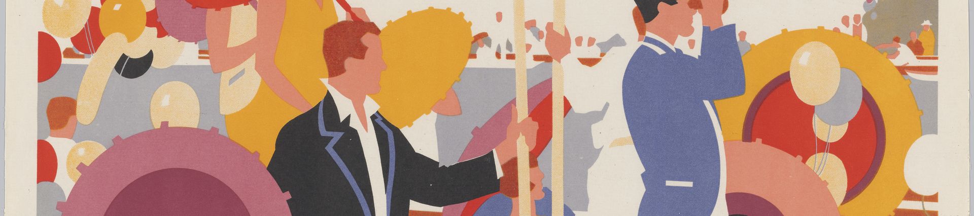
Brightest London

The poster is ultimately a reflection of society – its fashions, obsessions, products and services all captured in a moment in time. This is clearly conveyed in this poster by Horace Taylor, which was voted the public’s favourite Underground poster in 2013 to celebrate the system’s 150-year anniversary. Its use of bold flat colours and its depiction of people on their way to a night on the town in quintessential 1920s fashions seem to typify the ‘golden age’ of the Underground poster of this period.


