The birth of London’s transport posters
Introduction
The modern graphic poster came into use in the 1890s, revolutionising the fields of publicity, advertising and propaganda. As the London Underground started to become a more unified network in the early years of the twentieth century, it quickly harnessed the power of graphic posters.

Frank Pick, the future Chief Executive of the whole of London Transport, was given responsibility for the Underground’s publicity in 1908. Despite a background as a solicitor and administrator, Pick instantly recognised the potential of posters. The Underground Group’s early publicity had been ineffective, with posters that were largely text based and failed to convey a strong sense of brand identity. Pick rapidly began to commission posters to correct that situation.
The first of many

Pick started his new publicity drive by commissioning an established commercial artist, John Hassall, to design a modern graphic poster. This was to change the public face of the Underground forever. ‘No need to ask a p’liceman’ was the first in a long illustrious line of posters that established the Underground as an important patron of the arts and an acknowledged leader in the field of poster publicity.
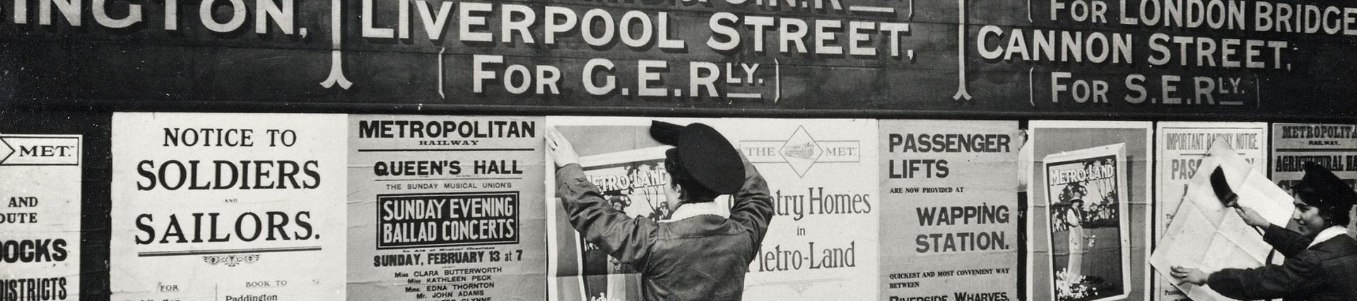
It depicts a generously proportioned policeman pointing out that the Underground was the gateway to London. The design also emphasises the increasingly cohesive identity of the Tube, showing the distinctive tiled interior of a station complete with an early version of an integrated Tube map and distinctive ‘UndergrounD’ lettering.
The way for all

An Alfred France design from 1911 uses some of the same elements to stress that the Underground network was for everyone, from the well-dressed woman in the foreground to the variety of characters silhouetted in the background, representing people from all walks of life. Apart from the District Railway at the time, travelling on the Underground was classless. The posters that Pick commissioned emphasised this universal appeal.
Focus on the destination


Pick was aware that almost every attraction in London was within reach of the Underground, or at least could be marketed as such. Eye-catching posters enticed prospective travellers indirectly, by focussing on the destination rather than the mode of travel.
Both of these examples emphasise the leisure opportunities and beauty of well-known London locations and events, incorporating the tiled ‘UndergrounD’ lettering above. They were also both designed by studio artists who worked for the printers, rather than being commissioned directly by the Underground.
Integrated travel and design

The posters also reflected the increasingly integrated nature of London’s transport services, with publicity soon extended to subsidiary bus and tram companies. This design, by the prolific artist Walter Spradbery, subscribed to the same ‘soft sell’ approach, using an idyllic rural scene to tempt city dwellers out of London on a bus.
Modernity and modernism


Pick also commissioned posters that emphasised the modernity and comfort of London’s transport. Sharland’s poster highlights the electrification of the Underground, with Lawrence’s depicting a well-designed train interior. Both feature the ‘UndergrounD’ brand identity. Lawrence’s design also demonstrates how many Underground posters reflected modernist art movements of their time, his bright and exaggerated colours showing the influence of Henri Matisse and Fauvism.
High quality design

Unsatisfied with the quality of design offered by commercial artists employed by printing firms, Pick increasingly organised commissions directly with artists and illustrators. He approached skilled and respected practitioners of their day, but also younger, lesser-known artists. In 1915, Pick spotted the talent of Edward McKnight Kauffer, an American-born designer who went on to dominate the British poster art field. Kauffer produced many of the Underground and London Transport’s best-known posters up until the Second World War.
This emphasis on quality reflected Pick’s belief that posters fulfilled a loftier purpose than simply encouraging greater use of transport services. He had a passionate commitment to good design and an enlightened approach to the commercial application of art. Pick saw the potential of posters to enrich the quality of urban life in London. He saw the need for a cohesive identity for London’s transport posters, but also variety within that identity. This thinking was to continue in London’s transport posters for many years to come.


