
Historic posters reimagined
Introduction
From the beginning of the 20th century, travellers in London have been encouraged to use public transport by original posters, designed to catch the eye.
Commissioned by London’s transport operators they have been produced by imaginative artists of the day in a wide variety of styles and themes. Today over 5,000 are cared for in the Museum’s collection.
This exhibition looks at some of the classic designs that have gone on to provide inspiration for a new generation of artists. Whether promoting travel etiquette, or sightseeing in the Capital, these posters show us how memorable designs and messages can be cleverly reinterpreted for contemporary audiences.
Reawakening
In May 2021, one of the vintage posters in our collection returned to the network in celebration of London’s ‘reawakening’ from the coronavirus pandemic.
The poster, originally designed in 1931 by Ernest Michael Dinkel, features a brightly-lit cityscape that promotes travel to the West End. The image features the Eros statue, which had returned after being temporarily removed during the redevelopment of Piccadilly Circus station.


Posters

Highlighting the advantages of travelling and shopping by bus, this poster makes London seem smaller and very accessible. In a single loop, it captures a family enjoying a successful shopping trip on route 65. Only the traffic warden, deprived of parking tickets, appears unhappy.

Here, one of London’s famous red buses encircles the Capital’s famous landmarks. The poster visually reinforced how easy it was to see all the sights on a London Transport sightseeing tour.
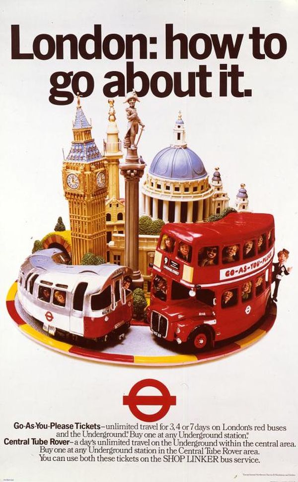
A unique model made of plasticine was created for this poster by illustrators and model makers Ray Campbell and Robin Boutell. The theme of London’s landmarks encompassed by public transport has become a popular way of representing London’s transport services.

This 1920s poster was one of a series produced by Herrick. Each poster used a different sense – sight, taste, smell, touch and hearing - to illustrate the different ways London could be experienced. Here, the theatre binoculars accentuate the sense of seeing by suggesting that London is a stage.

This more contemporary design mixes ideas about seeing and hearing. In the early days of portable music, it addressed Tube etiquette by using a cassette tape to represent eyes. Passengers were reminded about being aware of their surroundings when listening to music on public transport.

This poster, one of a pair, is regarded as one of the Underground’s most iconic artworks. The artist and photographer Man Ray depicts the roundel with Saturn touring the night sky. His clever ‘rayograph’ method created images by exposing objects directly on to light-sensitive paper.

The Simply poster series was commissioned by London Transport to promote different aspects of London’s rich social life. Directly referencing Man Ray’s poster, this design transforms the planet Saturn into a dramatic headpiece to promote London’s fashion week.

Graphic designer, Victor Galbraith, uses an eye-catching design against a black background to promote night time travel. The familiar London pigeon is portrayed holding a bunch of balloons, which remind us of all the exciting activities the city provides as evening entertainment.

Here Stevens uses a child’s favourite toy to recall the fun of sightseeing and promote some of London’s most popular sites. The dark background helps to highlight the bright colours of the windmill.
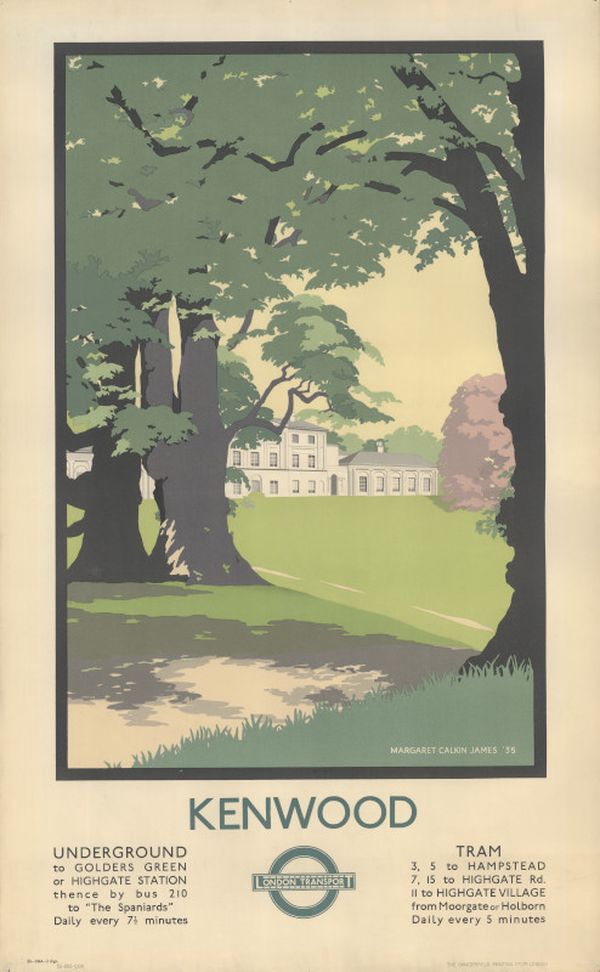
This poster promotes Kenwood House, on the edge of Hampstead Heath in north London. Trees frame the image and invite the viewer to explore the former stately home, which boasts neo-classical architecture and Rembrandt’s self-portrait amongst other features.

In this early 1930s design, Marty uses a relaxing picnic scene to promote countryside escapes. The poster is accompanied by an extract from William Blake’s poem, ‘The birds’.

Boat oars take centre stage in this 2007 design. Emphasising simple lines and using three shades of blue to reflect the Oxford and Cambridge colours, the poster informs visitors where to position themselves to get the best views of the race.


These posters take an aerial view of the boat race to encourage people to attend the event. Although the posters are over 30 years apart, Hickmott and Paine both take a similar approach in their use of bold graphics and the team colours.

This poster depicts a party scene and promotes the use of the Underground after dark. Here Taylor experiments with flat colour to illustrate the vibrancy of 1920s London. The posters provided a splash of colour in a city still largely drab and grey after the First World War.

Inspired by screen-printing techniques, Morland’s restaurant scene encourages eating out and the use of public transport in London. This poster is part of the 2016 ‘Brightest London’ poster collection, which echoes and expands on the social scenes and colour of Taylor’s iconic 1920s images.

Sayer’s striking poster is one of a pair of posters. The accompanying text panel encourages butterfly-watching throughout the Capital by listing sites where butterflies may be seen. The open-winged butterfly represents the freedom of travelling beyond the city.

Lepidoptera is the name for the group of four-winged insects comprising butterflies and moths. To promote visits to the Natural History Museum, Cooper uses an airbrush and stencils to create his beautiful butterfly.


