Edward Johnston: the man behind London’s lettering
Introduction
The Johnston typeface was created a century ago for London Underground by Edward Johnston. Since its introduction, this lettering has come to represent not just London’s transport but the idea of London itself.

Early years
Edward Johnston, the son of Scottish settlers, was born on their remote ranch in the province of San José, Uruguay. The family returned to England when Johnston was three years old. A creative child, he was absorbed by the popular Victorian hobby of ‘illuminations’, the copying of texts in the manner of a mediaeval manuscript.
Career
Johnston had initially enrolled at Edinburgh University to study medicine, but in 1895 he abandoned this field in favour of working in the arts.
On arrival in London, Johnston had what he described as the ‘miracle of his life’ when he met William Richard Lethaby, the founding Principal of the Central School of Arts and Crafts. After seeing samples of Johnston’s written illuminated work, Lethaby commissioned a work from Johnston and urged him to study manuscripts at the British Museum. When Johnston delivered his commission, he was astonished to be offered a post teaching illuminating at the Central School.

Before resettling in London, he embarked with his cousin on a three-month trip to Canada via the USA. Having returned from his trip well before the start of his new role, Johnston spent more time in the British Museum and was encouraged to study Roman and Renaissance lettering. Rather than simply being a Victorian ‘illuminating’ class, his new course at the Central School would rework and re-establish this tradition of hand-lettering. Over four decades of teaching, including many years at the Royal College of Art, Johnston influenced numerous artist-craft workers, including the brothers MacDonald and Eric Gill.
He married in 1903 and had three daughters with his wife, Greta. For a time, he lived at Hammersmith Terrace in west London, where there is a blue plaque to him. In 1906 Johnston published his widely influential book Writing & Illuminating & Lettering. In this volume, Johnston expressed that lettering should always aspire to the qualities of ‘Readableness, Beauty and Character’.
In 1912, Johnston moved to Ditchling in Sussex to be near his friend Eric Gill, the letter cutter, carver and wood engraver. Over the years, others would also make the same move to Ditchling, which became a centre for artists and craftspeople. Johnston lived there until his death in 1944.

London’s lettering

In 1913, Johnston met Frank Pick, Commercial Manager of the London Underground Group. This meeting ultimately resulted in the commissioning of Johnston’s Standard Block Lettering for the Underground and the London Underground ‘bullseye’ symbol.
Pick’s immediate objective was to drive up fare income. He set about making the Underground more attractive to passengers by publicising it more effectively, by making its stations easier to identify, as well as by making the system easier to use and to navigate in order to encourage repeat business.
It was with these principles in mind that Johnston submitted the first examples of Johnston Capital letter block letter type to Pick, in February 1916.


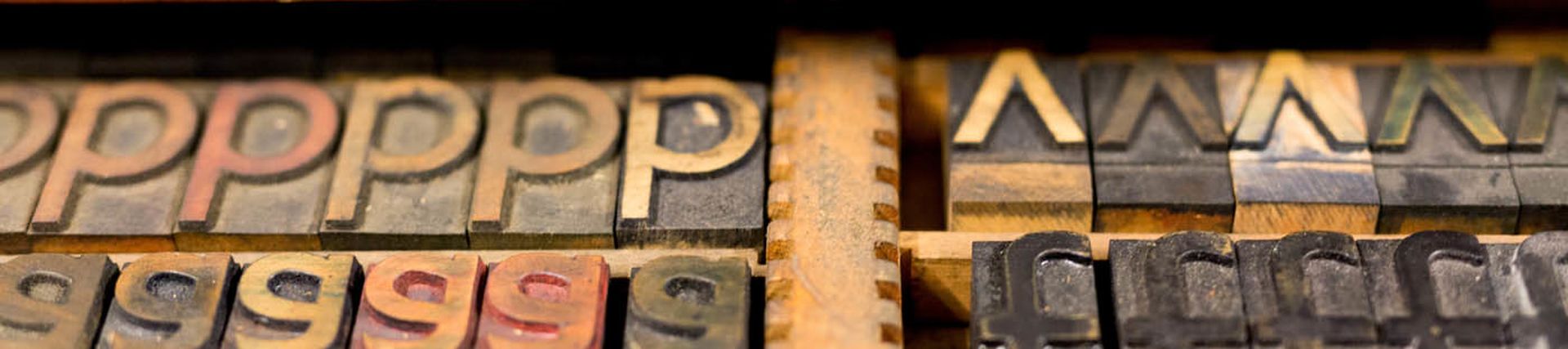
The first use of the Johnston typeface was in wooden block prints for posters. The sans serif type, characterised by the absence of little strokes (serifs) around individual letters, was soon used in signage in the development of the new Tube extensions and station refurbishments in the 1920s and 1930s.

At the turn of 1916-17 Pick asked Johnston to redesign the trademarks for the Underground Group including the bullseye logo that Pick had first initiated in 1908. Johnston refined this to the now familiar branding of the bar and circle we still see today, which is recognised the world over.
Johnston’s legacy


In the 1970s, London Transport examined the suitability of continuing to use Johnston’s san serif or replacing it. In 1979, Eiichi Kono, a young Japanese designer working for Banks and Miles, revised the original Johnston with slight changes to the proportions to some of the letters and created bold and italic fonts.
In 2016, Monotype was commissioned to review the typeface again. Monotype Director Nadine Chaline and Senior Type Designer Malou Verlomme focused on revising the iconic lettering in light of digital developments and additional symbols that have become commonplace in the 21st century. The result - Johnston100 - has been rolled out by TfL since 2016.


Despite these changes, the importance of Johnston’s contribution to London’s transport system is clearly demonstrated in the memorial that was installed at Farringdon Station in 2017. Designed by Fraser Muggeridge, the memorial is an unapologetic celebration of Johnston’s typeface, which has become a classic of wayfinding design and modern lettering.


