Poster Power - The way for all
London Transport has a long tradition of commissioning established and emerging artists to design advertising posters for the transport network. London Transport Museum’s collection holds around 15,000 between posters, prints and original artworks, the majority of which are housed in our Art and Poster store at the Museum Depot in Acton. As part of our Poster Power online celebrations from 25 April to 3 May 2020, we have asked Nick Gill, London Transport Museum Friend and volunteer guide for 17 years, to tell us about his favourite poster in the Museum’s collection.
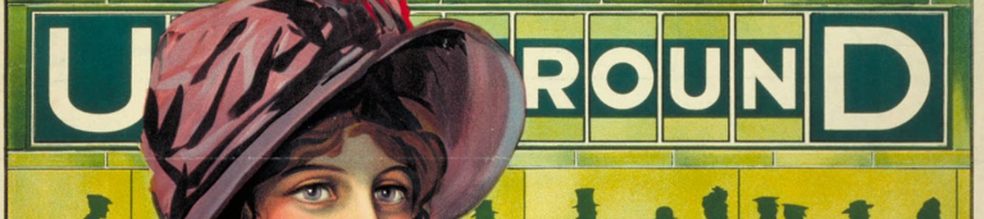
My favourite poster in London Transport Museum’s collection is The Way For All by Alfred France (1911), both for the stunning visuals and the powerful statement about travel for all on the newly-formed Underground Electric Railways of London (UERL).
The Way For All is among a number of posters commissioned between 1909 and 1912 by Frank Pick. Before becoming London Transport’s first Chief Executive, Pick was Marketing Director of the UERL, having been appointed in 1906. A great visionary, he commissioned artists and graphic designers to create artwork for the UERL’s intense poster campaigns, and quite significantly he did so irrespective of gender, thus bucking the trend prevalent at the time.

The central figure in Alfred France’s poster represents a middle-class woman who could be a member of the Suffragette movement, highly topical at that time. The poster’s message is that women should feel safe to travel alone on the new Underground. The backdrop depicts silhouettes of people from all social backgrounds who can use the classless Underground for business or pleasure, with just one level of fare. The choice of the colour green is a nod to the booking hall tiles typical of Leslie Green’s station design.

Leslie Green’s design was heavily influenced by the contemporary Art Nouveau and Art & Crafts movements and complimented the modernity of the world’s first underground railway. The frieze in the poster alludes to the ornamental green dado friezes in Green’s design.
The story around the original artwork for the poster is quite interesting; the UERL Board considered the central character to be somewhat lacking in colour and bearing an air of intimidation in her stare. They also found the backdrop to be cold and uninviting. The lithographers were therefore requested to bring more colour into the poster and adjust the lady’s stare to a gentle distant gaze.

There is a strong feminist tone to the poster’s message which proclaims no social boundaries on the Underground. The poster also represents a strong link with the contemporary design of the newly-formed UERL which soon became known as the Tube.
To me, this poster sums up everything Frank Pick believed in when it came to design: beauty, utility, goodness, truth, immortality, perfection, righteousness and wisdom.