The evolution of the roundel
Introduction
The roundel, the symbol of London’s public transport and a powerful icon of the city, is over 100 years old.
From its humble beginnings as a platform name board in 1908, the roundel has become a famous company trademark, providing a unified corporate identity for all London’s transport services - from trains and buses, stations and bus stops - to staff uniforms and publicity.
Over the years there have been many attempts to redesign it – or even get rid of it completely.
However, the roundel has survived into the 21st century to become one of the most recognised and imitated logos in the world.

London General Omnibus Company (LGOC) logo
In 1905, shortly before the roundel was introduced, the London General Omnibus Company (LGOC) registered the ‘winged wheel’ as its trademark.
It only briefly appeared on the company’s fleet of motor buses, but remained on uniform badges - like this cap pin - until LGOC became part of the Underground Group in 1912.

Early Underground roundels
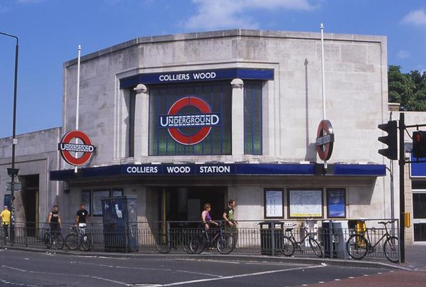
The roundel first appeared on Underground station platforms in 1908. The bar and circle, as it became known, comprised a solid red enamel disc and horizontal blue bar.
These early roundels, framed with timber mouldings, were introduced as station nameboards. The new device gave prominence to the name of the station, and helped passengers distinguish it from surrounding commercial advertising.


Did you know?
You can still see some diamond-shape roundels on the network. They were installed at Moorgate station to celebrate the 150th anniversary of the Metropolitan line in 2013.
The Underground font
In 1908, the various separate underground railway companies agreed to use the term ‘Underground’ for all their joint promotion of services.
A distinctive logotype (also known as a word mark), designed with a large initial U and final D, began to appear outside stations and on advertising material.
Like the bar and circle, this marks a significant step towards establishing a coherent graphic identity for the Underground. The word mark and new bar and circle logo were used across the network, from station signage to posters.


The Metropolitan Railway
From mid-1914, the Metropolitan Railway introduced its own version of the Underground roundel. This originally appeared as a blue station name plate across a red diamond. The symbol was also used on publicity material and timetables, as shown here.

Johnston's roundel

In 1915, the Underground’s publicity manager, Frank Pick, commissioned the calligrapher Edward Johnston to design a company typeface. By 1917 the proportions of the roundel had been reworked to suit the new lettering and incorporate the Underground logotype. The solid red disc became a circle, and the new symbol was registered as a trademark.
By 1919 Johnston’s standardised roundel symbol was being used on publicity. It began to appear on station exteriors and platform nameboards from the early 1920s.
In the 1920s, Johnston introduced exact guidelines for the reproduction of the roundel. The proportions of the bullseye, as he called it, were re-designed to incorporate the standardised company typeface.
Between 1920 and 1933, Johnston designed a variation of the roundel for each operating division of the Underground Group. This provided a unified identity for both rail and road services.


Holden adopts the roundel
The roundel became an integral part of station architecture in the 1920s. From 1924, Frank Pick commissioned the architect Charles Holden to design new stations and reconstruct existing ones.
Holden introduced the roundel to station architecture in a number of ways. Venetian masts appeared outside stations, which acted like flagpoles to support the logo in three dimensions. Stained glass roundels were incorporated into clerestory windows above station entrances. The architectural roundel greatly assisted passengers in identifying stations at street level.
In the early 1930s, Holden began designing new stations for the northern and western extensions of the Piccadilly line. Roundels were introduced on station platforms, with thin bronze frames to match the new handrails and poster frames.
The roundel, which continued to act as a platform name board, was now incorporated into the very fabric of the station interior. During the 1930s, Holden also employed the roundel in his designs for bus stop flags and shelters.

London Transport's corporate identity
A London Transport Design Panel was established in 1963 to coordinate in-house design of the Victoria line.
The panel included Harold Hutchison and design consultant Misha Black of the Design Research Unit (DRU). By the early 1970s, the DRU was employed to review the whole corporate identity of London Transport, including the design and use of logo and typeface.
In 1984, London Regional Transport (LRT) was established. A new corporate logo was designed to distinguish LRT from its operating companies, London Buses and London Underground. However, the logo was short-lived and never achieved the impact of the roundel.
Each operating subsidiary of LRT was given its own version of the roundel. London Underground took this opportunity to rationalise its own signage, commissioning design consultants Henrion, Ludlow and Schmidt to advise on their logo in 1984. Their blue and red Underground roundel strongly resembled that introduced by the Design Research Unit in 1972.
In 1987, the corporate identity consultants Wolff Olins were given the task of developing roundels for the other operating subsidiaries of London Regional Transport, thus linking the family of operating companies.
In 1990 LRT and its subsidiary operating companies: London Transport Buses and London Underground reverted to the group name London Transport. Again the roundel was employed as the unifying symbol, to identify and link the companies in the minds of the public. Joint group services were identified by a red roundel. Both rail and bus roundels appeared together on common publicity.


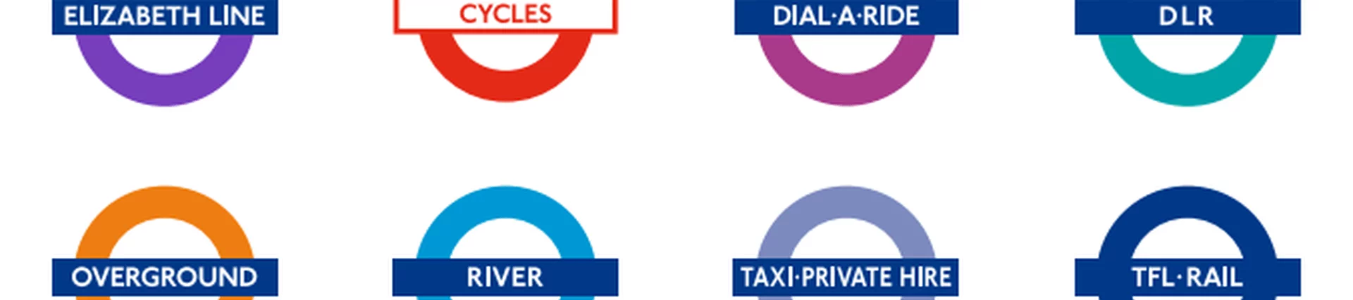
On 3 July 2000, Transport for London (TfL) was created to manage the majority of transport services in London. As well as the bus system, TfL had responsibility for taxis, London river services, Victoria coach station, Docklands Light Railway, Croydon Tramlink, Street Management, Dial-a-Ride and London Transport Museum. In 2003 London Underground became part of TfL, and from 2007 part of the suburban rail network was transferred to TfL, branded as ‘Overground’.
The decision to continue using the roundel as the identification of both TfL and its ‘modes’ was taken early on in the organisation’s history.
Since then a ‘family’ of roundels, using different colours to badge the various services, has been developed. This is based on a plain blue roundel for TfL with other colours denoting the various services. Each mode has subsequently gained an independent identity, whilst communicating that they are part of a wider organisation.
Any non- roundel logos were eliminated as part of this process.


