Mapping London: the iconic Tube map
Introduction
A public transportation system would be of little use if its passengers were not able to easily and reliably make their way across the network. A map is one critical tool to make this possible.
London’s diagrammatic Underground map, first devised in 1931 by Harry Beck, can truly be described as a design classic. Over time, the map has evolved from tracing the first railways in the Capital to encompassing an integrated network that covers ever growing distances. Today it is distributed for free by Transport for London (TfL) and appears in different formats. Despite being under the eyes of passengers daily, the story of this iconic map is difficult to appreciate at first glance.

The first maps
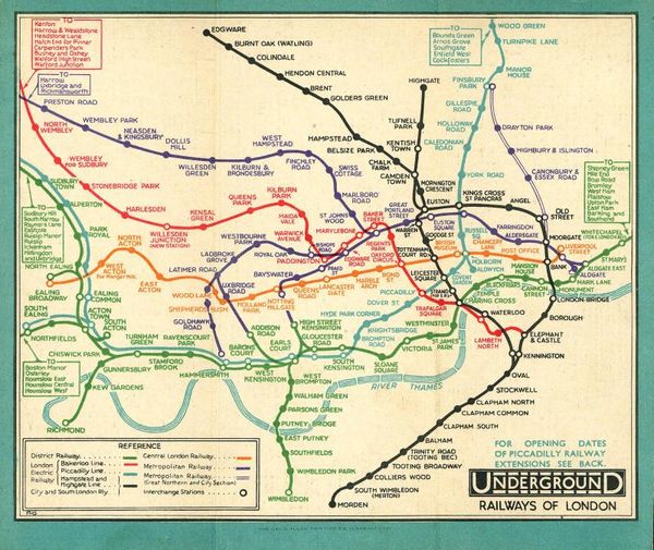
London’s first public transport maps were produced by the Metropolitan and Metropolitan District Railways, which were established in the 1860s and 1870s respectively. These maps showed times of services, connections with horse buses and even places of interest. They were geographic maps that showed where passengers were in relation to the streets above. As the Underground expanded with the opening of new lines during the 1890s and 1900s, maps had to include more information.

In 1908, London’s various underground railways produced a single map to publicise their operations as part of an integrated system. This standard map, printed as a poster and a pocket map, served as a guide to the Underground and enabled people to find their way around London.

However, the map and its successors, which were produced by the Underground Group of companies, demonstrated the limits of the geographical approach to mapping the Underground system. Attempts to include the extremities of each line resulted in a very crowded central area, making the map difficult to read.
The diagrammatic map
A big change in the way the Underground railway system was mapped out came in 1931. In his spare time, Henry (known as Harry) Charles Beck, a temporary draughtsman for the Underground, had designed a radically new map.
The dense central section was enlarged in relation to the outlying areas, allowing both to be shown more clearly. The map dispensed with conventional geographical accuracy, aiming to enable passengers to understand the network more quickly and simply. It used only horizontal, vertical and 45º lines, and the Underground lines were represented by a set of standard colours. Beck’s idea was initially rejected by the Underground’s publicity department for being too revolutionary.

Beck made some alterations, in particular making station names more prominent and replacing circular ‘blobs’, representing stations, with the now familiar rectangular ‘ticks’. After Beck put forward his proposal again, a version was produced as a trial pocket map in 1933. It was an immediate success with the travelling public, and new pocket editions and posters were soon published.
In 1933, a unified London Transport (LT) had brought separate companies and modes of transport together into one entity. Beck’s map became another important aspect of this integrated system and its identity.

Modifications
Since its introduction, Beck’s design classic has undergone and withstood numerous modifications. For 28 years, Beck experimented with new versions of the map, accommodating suggestions from both the public and LT.
Amongst the earliest changes was the introduction of a ring as the symbol for an interchange station. In 1935, the red and orange Bakerloo and Central lines, which were difficult to tell apart under artificial light, were altered to brown and red. In the early 1940s, although no longer working for LT, Beck continued to revise the map in his own time. Experiments with 60° diagonals were not successful and he reverted to the original 45° system.

Beck regarded the 1950 map as his finest. It is notable for showing the Circle line for the first time as a separate line, and for representing interchanges as open circles joined by white lines. In 1960, Beck ended his association with LT.

During the 1960s and 70s, the map had to be modified to incorporate several new extensions, most notably to Heathrow Airport, and the new Victoria and Jubilee lines.

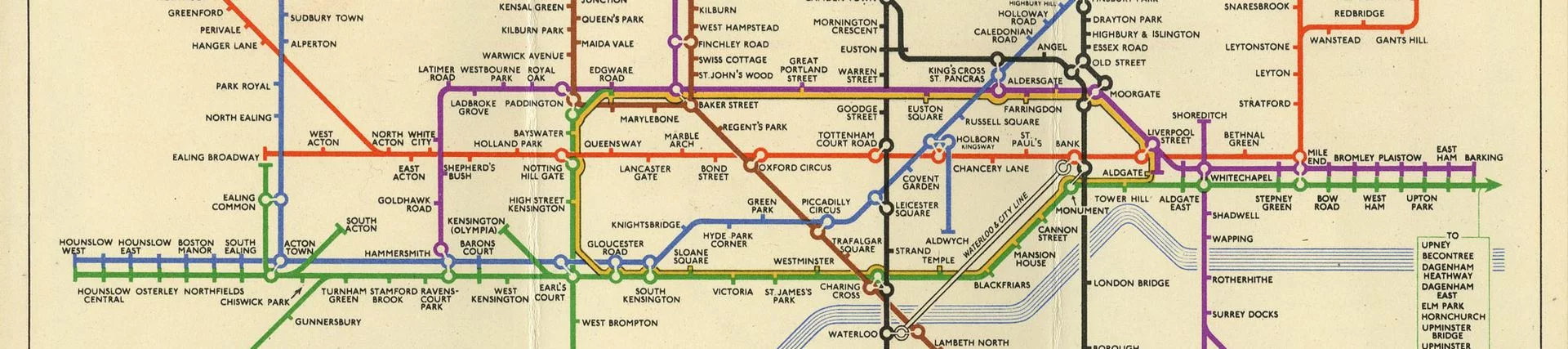
The current map: Journey Planner
The current map is known as the ‘Journey Planner’ and includes the Docklands Light Railway, Overground, Tram, Emirates Air Line and TfL Rail lines.
It could be argued that the simple clarity of Beck’s classic map is being compromised to include as much information as possible. Nevertheless, that so many additions have been successfully made says much for the versatility of Beck’s original design, while also reflecting the many diverse modes of public transportation that have become part of the integrated system managed by TfL.

Other official maps
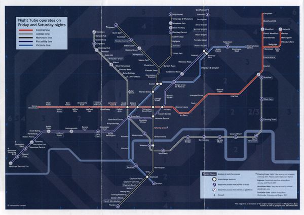
Over the years, specific features and new services have led to the creation of different official maps. Blue symbols were added to the map to show stations with step-free access from street to platform. Grey and white areas identifying zones were added to the map. These zones have a direct correlation to ticket fares. A night-time service was introduced in 2016. It is available on selected lines on Fridays and Saturdays and has been visually represented with the Night Tube map.
Following the widespread use of smartphones and travel planning applications, in August 2020, TfL Go was released. This is a free app, developed by TfL. In the words of Head of Experience, Hanna Kops, ‘TfL Go has brought the iconic Harry Beck Tube map into the digital age for use on mobile devices while customers are on the move.’

Inspiring maps around the world
The London Underground map is internationally recognised as an example of graphic and information design excellence. Many other urban railways including New York, Sydney and the Saint Petersburg metro, have ‘borrowed’ Beck’s concept for their own maps. Beck actually produced a proposal for the Paris Metro. This was not used, although the eventual map incorporated elements of Beck’s design for the London version.
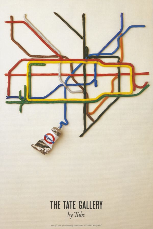
Many artists have also been inspired by the map and have remade it in different materials: from acrylic paint to Lego. However, the map design is controlled as part of TfL intellectual property rights and its use on commercial products is regulated through licences. This reflects its worldwide fame as a key part of the brand identity of the Underground, Transport for London and, by extension, London itself.