A brief history of the pocket Underground map
The first steps (1908 - 1926)
Until the 1900s railway companies generally produced maps to promote only their own services, overprinted in red onto existing maps, with other lines given second billing – they didn’t give free publicity to their competitors. The Underground Electric Railways of London (UERL), established in 1903 with financial assistance from the American entrepreneur Charles Tyson Yerkes, was the first London company set up to run a group of linked railways. The UERL brought together the District Railway, and three new tubes still under construction that opened in 1906-7 – the Bakerloo, Piccadilly and the Charing Cross Euston & Hampstead Railway, known as the Hampstead Tube (today’s Northern line Charing Cross branch).

The first map to be produced by the UERL in 1908 showed its own companies (listed first on the key), but also the other tube lines and the Metropolitan Railway, in different colours. London’s underground railways were presented as a single network under the ‘UndergrounD’ brand for the first time. The UERL would take over the Central London and the City & South London in the next few years, but the Metropolitan Railway stayed independent until the formation of London Transport (LT) in 1933. The idea of the cross-promotion of the system under one name is attributed to Frank Pick – he was in charge of advertising and traffic development at the time, but was soon responsible for all aspects of design, including architecture, and signage, including rail and road vehicles. He went on to become Manging Director of the UERL and Vice Chairman and Chief Executive Officer of LT. His influence on the Underground through the power of design is commemorated in a memorial at Piccadilly Circus station.
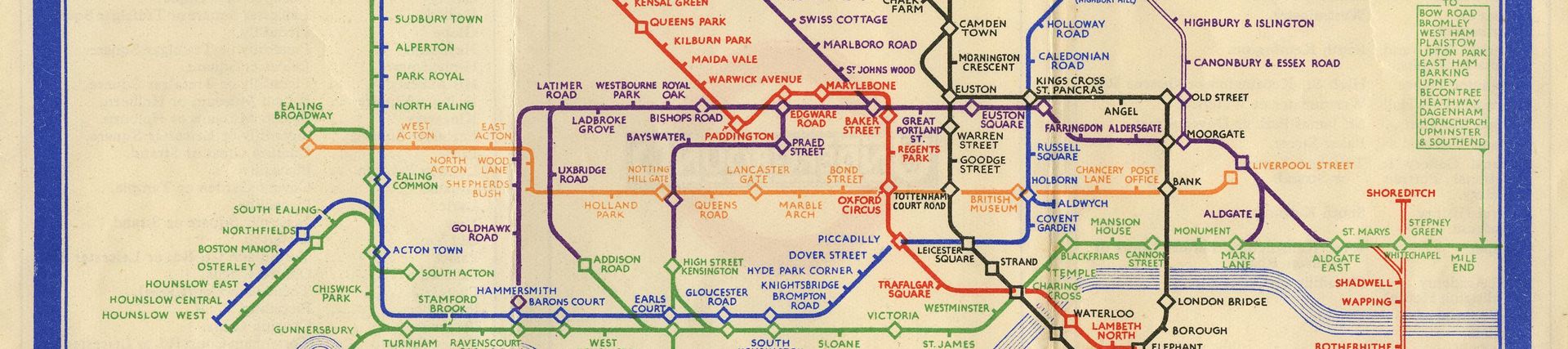
The 1908 pocket paper map is a simplified geographical representation of the network with ‘ghosted’ geographical features including main streets the River Thames. It is fascinating to work out the modern depictions of the lines shown. Some, like the District, and the Bakerloo still use the same colours as today, but others were swapped around in the 1920s and 1930s. One line, the Great Northern and City, became part of the Northern in later years but is now closed. Tramways, other railways and connections are also shown.

Macdonald Gill, the famous sculptor and typographer Eric Gill’s younger brother, was part of Pick’s circle. He was commissioned to produce a number of highly detailed and amusing illustrated poster maps for the UERL between 1914 and 1932. These popular posters are a subject in their own right, but in the 1920s he also produced less ornate maps of the Underground.
On the 1924 Gill map above, we see an early representation of the roundel with the white on black ‘UndergrounD’ brand. another of Pick’s contacts, the typographer Edward Johnston, produced a standardised version a year later in 1925. Gill’s map is a simplified geographical representation of the network but without a street background, and showing the stations evenly spaced. The Metropolitan Railway is shown as before, though it would be nine years before it joined all the other Underground railways upon the formation of London Transport in 1933. Initially this would not seem like one of Gill’s creation, but looking at the beautiful script work employed throughout the map there is a high degree of familiarity in this ‘serious’ map from him.
Six colours and various shadings are used to represent the different railway lines. A great deal of information is given to potential passengers in the boxes with solid red circles being overprinted at stations for the British Empire Exhibition that was held at Wembley in 1924. The Metropolitan, Bakerloo and District lines are truncated to save space, and railways under construction are represented by dotted lines. But there’s something missing!
As well as the street map background, Gill removed the River Thames from the map for the first time. It was re-instated by the map’s next designer, Fred Stingemore of the Underground publicity department. Stingemore produced 13 editions of the map between 1925 and 1932. His final design is below. The river would remain a firm feature of Underground maps for the next 86 years.
Unusually, a number of new extensions are shown in advance of opening. A panel on the back of the map gives approximate opening dates in 1932 and 1933. The text is hand-drawn Johnston lettering more in line with the Underground group’s brand, and easier to read than Gill’s script. A reduction in the dimensions of the map since Gill’s design clearly posed problems with fitting in all the station names whilst trying to retain a geographical style. The central area is enlarged and simplified, but this was only a temporary fix. This would be addressed properly by Harry Beck when his new design was first issued the following year.
A new design (1933 – 1959)
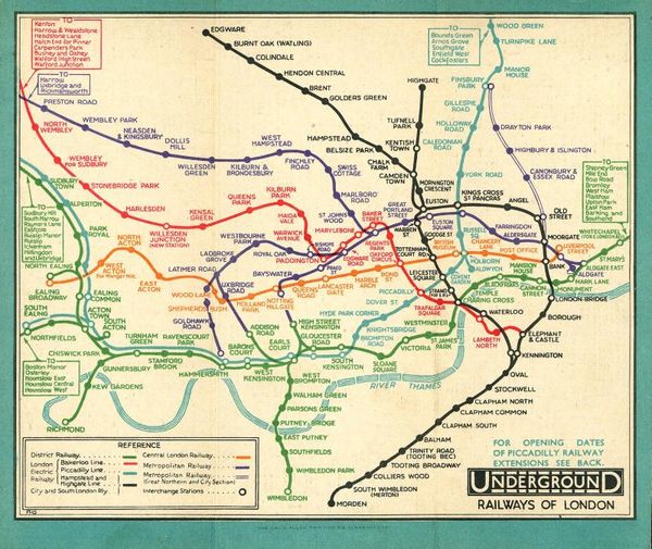
Henry C Beck, now better-known as Harry, had worked as a draughtsman for the Underground since 1924, but in 1931 he was out of a job. In his newly acquired ‘spare’ time he developed a new concept for the map, that moved away from a geographical representation of the Underground network to a diagrammatic style. His first attempt in 1931 was rejected, but with encouragement from his ex-colleague Stingemore, he persevered, and a refined version was accepted a year later. The first pocket edition of the map, shown here, was issued in January 1933. It was an immediate success with the public, and in time became a model for public transport companies across the world because of its clarity, simplicity and functionality. The map also represented the face of modernity and fulfilled Frank Pick’s belief in the power of good design.

At first glance this map is so familiar that it could be mistaken momentarily for a modern map. The colours have remained largely the same since 1933, though new lines have been opened and much extension work has been completed since then. Beck’s principles proved easy to adapt as the map grew more complex.
This first edition of Beck’s map immediately makes clear intended routes across the network; every destination seems close and quickly accessible. Gone are all the curvy and wiggly geographic lines in favour of right angles and 45-degree angles with diamonds indicating interchanges. Most of the complete lines are shown, though the District is shown only as far as Mile End, with the remainder of the eastbound stations to Southend being listed. The Piccadilly line extension from Enfield West to Cockfosters is shown as opening midsummer 1933.
The map is now recognised as a pillar of Transport for London (TfL)’s modern corporate identity, alongside Edward Johnston’s 1916 alphabet, and the bullseye symbol that we now call the roundel, that Johnston standardised, incorporating his typeface in 1925.
The Beck map appeared in the same ‘tri-fold’ format as the Stingemore map, and successive maps stayed the same size until 1996, when a fourth panel was added, for advertising and extra information. On the reverse, the practice of listing places of interest and their nearest stations was also carried over from the Stingemore version. On the central cover panel the public were invited to comment on the ‘new design for an old map’. Though the Railway Gazette reported in July 1933 that a ‘very large number’ of responses were received, they do not seem to have been saved.
750,000 copies of the first edition were printed, enough to last through to the summer, but Beck was never entirely satisfied with the design and was soon tinkering with it, changing the interchange symbols, and the spacing and positions of lines in the following years. In 1933 alone he produced two more slightly different pocket maps, a black and white diary version and two poster size maps, one in an unusual portrait format.

In his 3rd pocket map of 1933, Beck adds ‘London Transport’ above and below the pecked UndergrounD bar of the roundel. The northern sections of the Bakerloo line and the Stanmore branch of the Metropolitan line now lean at a 45-degree angle rather than being vertical as in the original January 1933 map. Similar tweaks are made between Hammersmith and Acton Town and at Paddington Praed Street and Covent Garden.
Beck’s last map was printed in 1960, though the design is the same as the 1959 edition. Always innovating, he added the grid, and an alphabetical list of stations on the reverse, in 1955. It is still used today.

A diversion corrected (1960 to present day)
A ‘new look’ version of the Underground map was attributed to London Transport’s Chief Publicity Officer Harold Hutchison in 1960. It was published first as a poster and then in pocket versions. Beck was not informed of plans for the new map and was deeply hurt. It is still closely related to Beck’s design style but with sharp rather than smooth angles. Mainline interchanges are indicated with a square rather than a circle. It functions as well as the Beck’s design in some ways, but it had none of the style of the original. Despite its deficiencies, and a hostile public reaction, Hutchison’s map was used for four years before being replaced. The 1963 version is shown below.

The map’s next designer, Paul Garbutt a long-serving LT railway planner, started tinkering with the map over the Christmas break in 1962. He restored many of Beck’s principles and established rules for further developments to follow, but also kept some of Hutchison’s ideas. Garbutt’s first map was published in March 1964, keeping Beck’s grid but showing Interchange stations as black circles, with a dot in the middle at mainline interchanges. The name ‘Aldgate’ is no longer split as Hutchison’s effort, and a zigzag line represents the escalator connection between Bank and Monument. By following Beck’s example Garbutt managed the addition of two new lines and several extensions over the next twenty years, often working with another in-house designer, Tim Demuth.

In 1984 the map was taken on by an external information design contractor, FWT Cartography, who also produced bus maps for LT at the time. Their output was not dramatically different from the standards set by Garbutt – the design was stable and needed only minor alterations, overseen the LT publicity office. In 1998 it was passed to another external designer, Clockwork. The same company, renamed LS London in 2005, again as Pulse Creative in 2010, have produced all Underground maps since then, overseen by in-house TfL designers. Individual designers or companies are no longer credited, but since 2001 all Underground maps have included the text ‘This diagram is an evolution of the original design conceived in 1931 by Harry Beck’.
